在前端实现设计稿过程中,经常遇到 border-image-source 这种border渐变的情况。如下
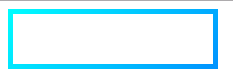
代码
<!DOCTYPE html>
<html lang="en">
<head>
  <meta charset="UTF-8">
  <title>border img</title>

  <style>
    .demo {
      width: 200px;
      height: 50px;
      border-image-source: linear-gradient(132deg, #00fcff, #009eff);
      border-style: solid;
      border-width: 5px;
      border-image-slice: 1;
    }
  </style>
</head>
<body>
  <div class="demo">

  </div>
</body>
</html>但是,当给元素来个border-radius 立马就变了样:

代码:
.demo {
      width: 200px;
      height: 100px;
      border-image-source: linear-gradient(132deg, #00fcff, #009eff);
      border-style: solid;
      border-width: 5px;
      border-image-slice: 1;
      border-radius: 50px;
      background: #000;
      box-sizing: border-box;
    }
border-radius 和 border-image-source不能一起使用,晕。。。
遇到这种问题,有人可能要问设计师要个渐变的背景图了。
其实,换个思路,也很好解决。
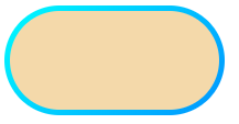
- 一个外层
div这个用border的渐变 - 内层div,水平垂直居中,遮盖外层中间部分,边角部分就是border了。
代码:
<!DOCTYPE html>
<html lang="en">
<head>
  <meta charset="UTF-8">
  <title>border img</title>

  <style>
    .demo {
      width: 200px;
      height: 100px;
      background-image: linear-gradient(132deg, #00fcff, #009eff);
      border-radius: 50px;
      box-sizing: border-box;
      position: relative;
      display: flex;

    }

    .true-demo {
      width: 190px;
      height: 90px;
      background: wheat;
      border-radius: 50px;
      box-sizing: border-box;
      position: absolute;
      top: 50%;
      left: 50%;
      transform: translate(-50%, -50%);

    }
  </style>
</head>
<body>
  <div class="demo">
    <div class="true-demo"></div>
  </div>
</body>
</html>
效果如图